Five Interesting Album Covers
Written by Darshak Chudasama on May 3, 2019
Ever heard “don’t judge a book by its cover”? Well I guess in this case, I should be questioning the phrase, “don’t judge an album by its cover.” And to some degree, sure, I agree. However, cover art plays an essential role on my first impression. If you’re like me, you like to kill time in record stores and wander around as if you’re at an art gallery. Albums that visually appeal to my eyes are always the ones I grab first. That’s not to say that albums with bland covers are inferior or that they shouldn’t be loved (#UglyAlbumCoversDeserveLoveToo); I’m simply stating I find it impressive when album covers have enough appeal for me to actually want to listen to those albums. It’s even more impressive when the cover art ties to or in some way foreshadows the music that’s to be revealed inside it. Down below I’ve chosen five unique album covers with interesting backgrounds. It was very difficult for me not to go off in tangents about how great these albums are, so bear with me as I attempt to stay on topic, and explain the origins and the artists behind each piece. In no specific order, we’ll be starting with…
Death Grips: The Money Store (2012)
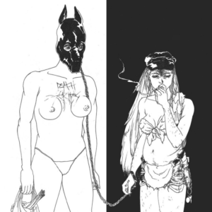
If you were to search Sua Yoo on Google, all you’re likely to find are scattered anime drawings and maybe a few Death Grips-related Reddit threads. Her website links you to her email and that’s about it. An artist from Chicago, she’s well known to have co-founded Rozliubit, a young company that specializes in elegant, handcrafted weaponry and armor. The Money Store cover art is an alteration of an illustration done by Yoo that was initially published in a zine. Death Grips explained in an interview with Pitchfork:
“On the cover you have an androgynous masochist on the leash of a feminist sadist who’s smoking. The sadist has carved Death Grips into her bitch’s chest. There is an overly confident quality to the woman smoking and a calmness to the androgynous masochist.”
The black and white backdrop stress even more of a separation between the sadist and masochist, contrary to the connecting effect of the chain. Ironically (or expectedly), the band has quite a similar relationship with their fans. The cover art remains an instant reminder of Death Grips: provocative (in this case through the near-nude figures) and progressive in its essence and forethought.
The artwork was supposedly inspired by a photograph, which you can find here.
King Crimson: In the Court of King Crimson (1969)
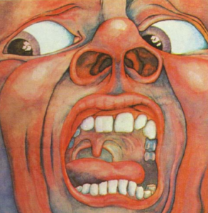
At first glance, any normal person might be a bit spooked by this artwork. However, as odd as it may be, no one can deny its gripping visual appeal. Whether it be the giant, cave-like nostrils or maybe the raw flesh-colored skin, the artist achieved the goal of any painter by provoking the viewer’s curiosity. What the hell is the man so terrified of? Well…the painting depicts Barry Godber’s perception of the “21st Century Schizoid Man.” Godber was an old friend of Peter Sinfield’s, who just so happened to be the co-founder and lyricist of King Crimson. Apparently, Sinfield played him a few tracks from their upcoming debut album and out came this masterpiece. The soft shades of blue alleviate the up-close, dire facial expression, while the hints of white seem to intensify his feelings of fear and overall tension. Progressive rock has had many eye-grabbing album covers, but few of them are as haunting as this.
In the Court of King Crimson was the only album cover Godber had ever done as he shortly passed away in 1970 from a heart attack – he was only 24.
The Clash – London Calling (1979)
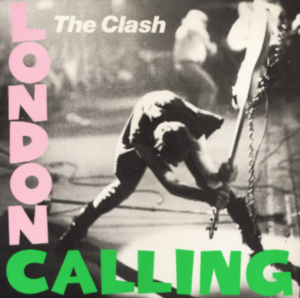
On September 21, 1979, Pennie Smith captured the ethos of punk rock in a blurry but powerful shot. Near the end of their gig at New York City’s Palladium, bassist Paul Simonon stacked up enough anger towards a meek crowd to lift his bass by the fretboard and smash it into the floor. Funnily enough, it makes the track “I’m so Bored With the USA” from their debut album all the more appropriate. His feet are parted a meter wide and his torso may as well be non-existent. What I would pay to go back in time and watch this happen live is more than I earn, I’ll leave it at that. The cover was inspired by Elvis Presley’s debut album, using the same coloring and format. Some see the picture as a representation of The Clash putting an end to the old rock and roll ways and marking the start of a new era. To me, it’s a pissed-off punk rocker looking to electrify the audience. It was a miracle Smith was there to capture such an iconic moment, but to the same degree, The Clash were a miracle band. They were young, dynamic, and ready to defy. Nothing says that better than this photo.
If you’re interested, more on the event can be found here and more of Smith’s photography can be found here.
GZA – Liquid Swords (1995)

Ah, such an amazing album, one of my favorites. The eccentric cover art makes Liquid Swords one of the most recognizable hip-hop albums of all time. In 1995, GZA released such a game-changing album that I could literally rant about its originality, influence, and all around cohesiveness for hours and hours. But before listening to a single track, the cover art itself was enough to reel me in. As the story goes, one day GZA and fellow rapper Masta Killa were playing chess matches, one game after another. If that’s not mentally strenuous enough, they were also baked. The marijuana caused GZA to have personified visions of the chess pieces, such as knights battling with weapons from swords to handy guillotines. The vivid thoughts were beautifully implemented onto the album cover with each fighter resembling a chess piece on a chessboard. On the the left hand side, we have what seems like a weak emcee getting brutally attacked. On the right hand side, we have the attacker, the genius himself GZA, slashing his opponent with his sword in his right hand and a tense left hand ready for any surprise attacks. A little further down, we have what seems like a faceless Wu-Tang member slaying another weak opponent. Never was Wu-Tang Clan one to back down from any challenge. GZA’s cover art on Liquid Swords creates a scenario where a crew foolishly attempts to usurp their throne, and it’s like watching one of those sad clips of a pride of lions mauling their prey.
Fun fact: GZA is a strong advocate for science education and co-created a program called Science Genius for high school students to engage in science through the art of emceeing.
Black Sabbath – Black Sabbath (1970)
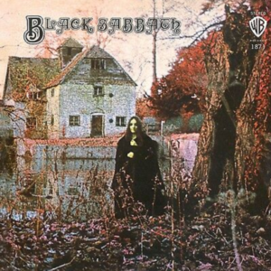
Here we have an unnamed actress being photographed for arguably the first heavy metal album to ever be created. A British photographer under the pseudonym Marcus Keef took this mysterious photo in front of a 15th century watermill in Oxford, England. Using infrared film, Keef created a false-colour effect to match the grim appeal of the music. The actual site of the photograph is a beautiful landscape with saturated greenery, and the watermill is built of aged red bricks. However, Keef used a proper technique that suits the aesthetic of Sabbath. The actress is dressed in an all black, witch-like robe and is rumored to be holding a black cat, though it’s pretty much impossible to see. What’s scariest to me is that she doesn’t seem inviting nor threatening, just ghostly. Her positioning is also ideal. Any closer to the tree and she’d seem withdrawn, and any further to the left, she’d mask the view of the hoary mill that seems to have been vacant for decades. Everything about the cover spits out metal, but the fact this was photographed and released in 1970 makes this is even more revolutionary.
Mysterious fact: Black Sabbath themselves never knew the person being photographed (allegedly named Louise), but years after the release of the album, someone dressed in a similar attire approached the band claiming to be her.
If that wasn’t enough, check out the gallery below!
